Overview
Adhering to the hero notions of “Buy Better” and “Renew”, known Source is a circular ecosystem of second hand specialists and dealers based in UK, committing to curate the best in fashion and discover high quality second hand fashion.
We identified the MVP from two pages and finally bolstered the design system by lifting the smoothness and viability of the interaction process.
What's the crutial imporvements our stakeholders crave?

Making it easier for users to find the right collection for them.
Tailoring navigation for
a personalized path of
searching products.
Empathize
During the research, we did 7 interviews, sent out a survey and got 93 responses back, gained 50+ data points.
Our exploration revealed 2 common challenges: users often lack incentives and the right prompts to seamlessly navigate to the collection page. Additionally, the presence of cumbersome product filters proves to be a hindrance, preventing users from swiftly finding their desired items.
Recognizing that the spirit of a brand surfaces through its shopwindow, we meticulously focus on details. By conducting a heuristic analysis internally, we identified and eliminated fundamental mistakes.
For fashionistas, a mismatch between high-quality products and an unprofessional display is a huge frustration.
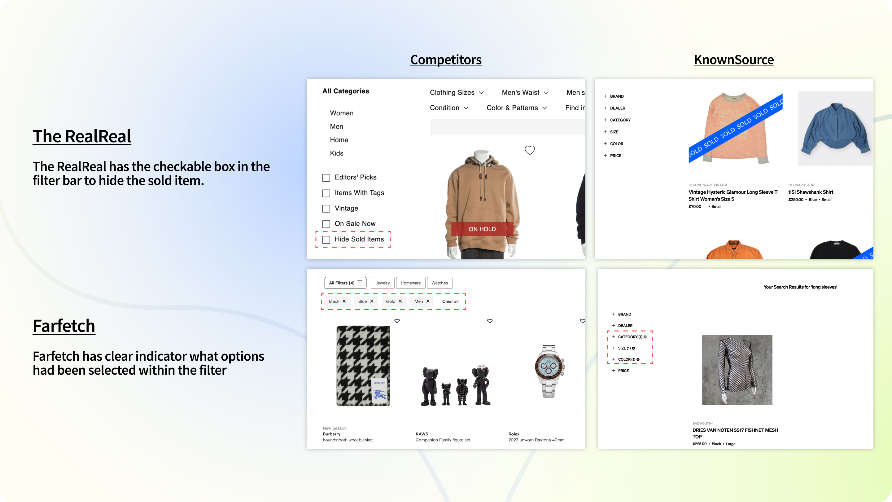

Competitor
Analysis
We then conducted a competitive analysis of four other second-hand fashion websites, uncovering additional areas for improvement within our own product features.
The findings suggest that enhancing the user experience through features such as hiding sold-out items, providing clear indicators for selected filters, offering detailed collection descriptions, and enabling mouse hover for instant previews can significantly improve user engagement and satisfaction. These features contribute to decluttering displays, ensuring visibility and clarity on chosen criteria, facilitating better content understanding and simple interaction. By prioritizing these enhancements, businesses can create a more streamlined and enjoyable shopping experience, leading to increased customer satisfaction and potentially higher conversion rates.

Pinpointing User Challenges
From the insights gained from interviews, we observed recurring issues that materialized in tangible page tasks. We also did our holistic evaluation.
Specifically, these challenges manifested as the ambiguous layout of the information module on the collection page and the inefficiency of the product filtering feature on the search results page.

User story
We compiled a list of user stories derived from user data that provide valuable design directions, and continuously reframed the problems we encountered based on these stories, which allowed for iterative problem-solving and improvement.
At this point, we decided to separate our work into two sessions, with each of their main features (MVP) for us to refine.
1. Collection Page - Information & Layout
- Lack of information on collection content
- Mismatch between collection name and thumbnail images
- Some Collections are empty inside
- Lack of clear recommendations
- Disorganized Layout
- Overwhelming information
2. Search Result Page - Filter
- Limited product baseSlow website response
- Irrelevant search result
- Sold-items are taking too much space
- Filter is hard to navigate with due to the multiple scrolling bars
- Lack of filter visibility
- Insufficient items for browsing

Suspected problems
The problem we suspect is that the collection page on KnownSource presents a challenge for users due to its lack of detailed information regarding the collection contents. The current layout, featuring only names and inconsistent images, is insufficient in effectively conveying the specific content or essence of each collection.
The problem we suspect is KnownSource’s current search result page is exhibits excessive scrolling and a lack of a clear indicator in the filter section. Also, a substantial number of sold items and identical items had occupied browsing space.
Elevating Visibility,
simplicity and Quality
within Minimalist Excellence.

0 1
We started by adjusting the frame of every single collection to align with the tone of our stakeholders, arranging personalized ones on the top of the collection page.

0 2
By bringing in more portals to potential desired collections, we add more chances for users to arrive collection page from both the search pop-up window and the bottom of searched items.

0 3
We enhanced the filter with components with a consistent style to facilitate customer to select more precisely.

0 4
Being aware of what have been filtered allows users to mediate their options to attain the best fit for them.
Make design Amplify
brand attitude;
Not dinimish.
Building upon the existing design framework, we unified the design language while infusing retro-inspired and dynamic elements with the essence and mood of stylish fashion looks to enhance the visual appeal of the web page.
Style Tile
We have standardized the frame style for the collection page to avoid user confusion and added detailed descriptions to each collection.
We've also implemented a hover function to reveal items inside, aiding users in better understanding the content of each collection and facilitating their search for the right fit.
Furthermore, we have expanded the placement of recommended collections, providing users with more opportunities to discover collections that suit their needs.
Collection Page

Based on user surveys and interviews, we have introduced filter options such as "condition" and "hide sold items." For the color filter, we've included a color guide to enhance user guidance. Additionally, a clear indicator has been added to help users easily identify the selected filters.
To improve the user experience, we've implemented a toggle feature for filters, allowing users to showcase more items on a single page. On each page, we've integrated recommended collections based on search terms to enhance the synergy between search result pages and collection pages, aiming to boost the conversion rate.
Search Result Page
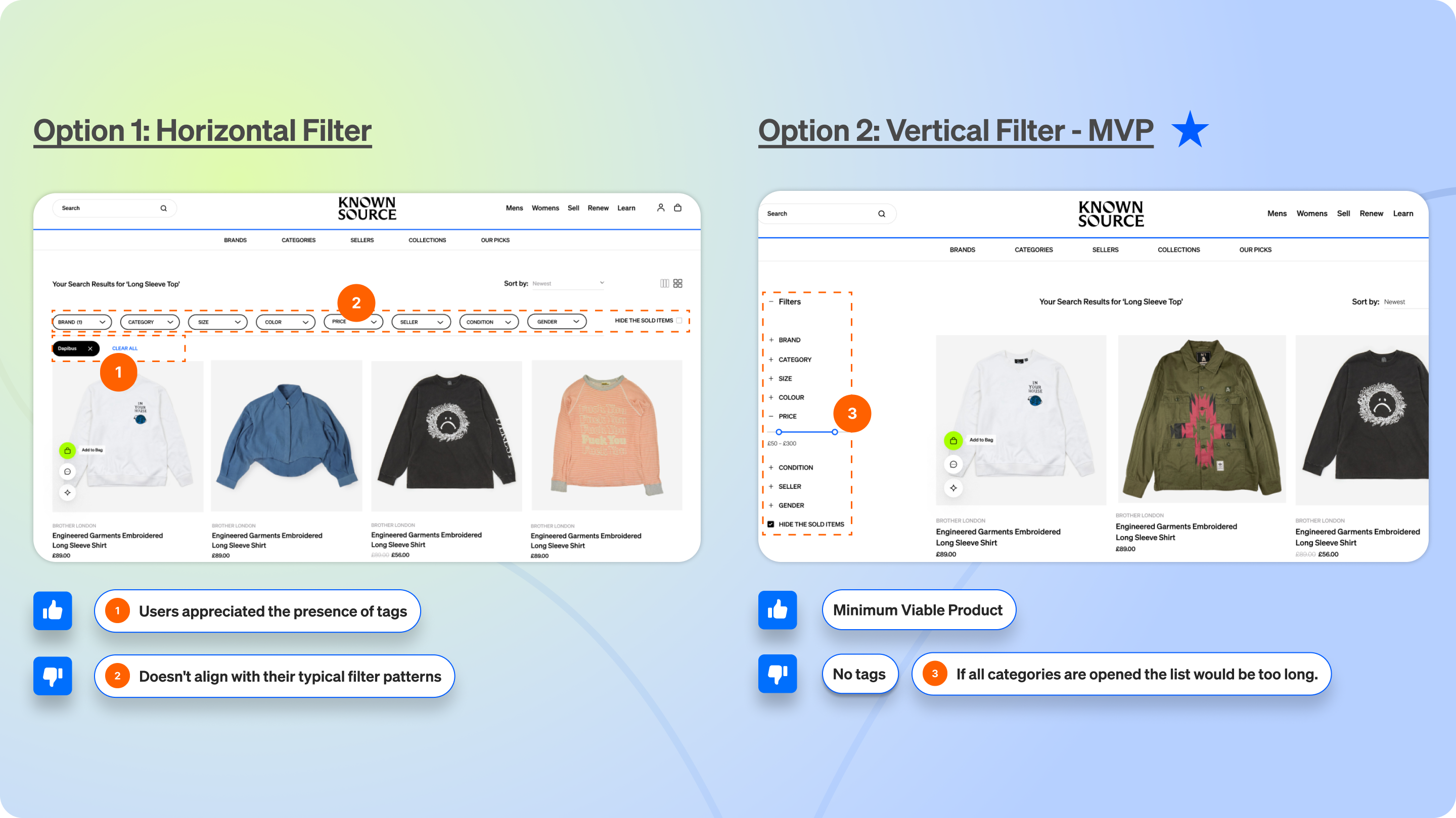

A/B Testing
After comparing the horizontal and vertical filter options and conducting user tests, we have opted to stick with the original vertical layout, as it requires fewer modifications.
This decision underscores the importance of prioritizing the content of the filter and aligning it with our business goals. By minimizing changes to the layout, we aim to maintain a seamless user experience while ensuring that the filter's content effectively serves the intended objectives.
User testing
We conducted user tests with MVP products respectively, and measured user satisfaction based on reliable formulas and models. Based on the comparison with the initial usability test, it can be seen that the time for most users to complete the task has been shortened, and they have gained a better interactive browsing experience.
From KnownSource:
The task was well-defined, and the research was clearly laid out. Understanding the steps taken to reach your final prototype was also very helpful, as it spurred some ideas for discussion. Some of the ideas presented were innovative, especially around the Collection Page.
Takeaway / Things to consider:
1. What technology would underpin the accuracy of the collection? And how would the image be selected for the For You collection?
- Due to time constraints, we remain cautious and open-minded about the technical support capabilities of cilents but we believe appropriately refine and update the technology such as content-based recommendation systems or algorithms to adapt to evolving user preferences and behaviors would be an accessible solution.
2. Why was one user unable to finish the task with the Search Results prototype?
- As designers, it's imperative to confront unsolvable variables and embrace imperfect data with a positive mindset. It's worth noting that this user didn't complete the entire journey in the previous test and has specific preferences regarding clothing and style. Given the chance, we aim to gather additional feedback through further return visits to gain more insights to enhance our design accordingly.
The things that I learned from this project are user feedback is pivotal in driving iterative improvements, and constant comparison ensures the pursuit of optimal solutions. Furthermore, maintaining open communication with clients is essential, as the design process is akin to a game of catch—a continuous exchange and mediation of ideas. Minimizing gaps in understanding among stakeholders helps achieve alignment with overarching goals.


